+86-18863350588
 English
 Français
 Deutsch
 Español

The Unspoken Gender Marketing Logic Behind Cup Color Choices
Content
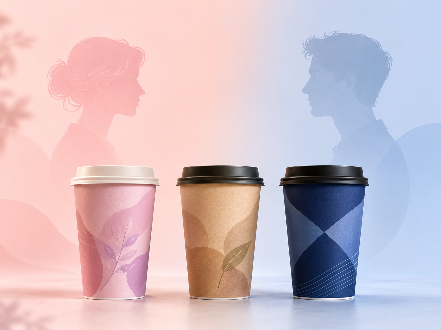
Walk Down Any Drink Aisle and the Pattern Repeats
Stand outside a bubble tea shop and a coffee chain on the same block, and the cups alone tell you who each one thinks is walking through the door. The boba shop leans into blush pink, lavender, and mint. The coffee chain sticks to white, black, or kraft brown with maybe a single accent stripe. Nobody at either company likely sat in a meeting and said "let's make this one feel feminine." But the color choice still lands that way, every time, at scale.
That consistency is the interesting part. Across categories that have nothing to do with drinks — cosmetics, cleaning products, even razors — the same split shows up: pastel and rounded tones read as feminine, dark and angular tones read as masculine. Cup design just inherited the pattern without anyone naming it out loud.
The Research Behind the Pattern
This isn't a hunch. A study published in the journal Marketing Science examined thousands of consumer packaged goods and asked reviewers to identify which attribute signaled a product's intended gender. Color came out on top, cited as the gender cue in the overwhelming majority of product images — far ahead of the product name or description. The researchers also made a point worth sitting with: this segmentation is largely manufacturer-driven, not something retailers layer on afterward through shelf placement or store aisles. The decision gets baked in at the design stage, long before a product reaches a shelf or a counter.
For packaging buyers, that reframes the question. A cup color isn't a neutral aesthetic pick sitting next to logo and font. It's doing identification work whether the brand intended it to or not.
Pink Isn't Selling Femininity — It's Selling Warmth
Here's where it gets less obvious. Research on gender cues in branding has found that pink and other feminine-coded colors don't primarily signal "this is for women." They signal warmth — approachability, friendliness, softness — while darker, more angular cues signal competence. And the effect isn't the same for every brand.
For an established company that customers already trust to be competent, adding feminine color cues can boost how warm and likeable the brand feels, without costing it credibility. For a new or unproven brand, the opposite happens: leaning into softer cues can actually lower purchase intent, because the brand hasn't earned the "competence" perception yet and now looks less serious on top of that. Masculine cues, in that scenario, do more to build trust.
Applied to cups: a decades-old coffee chain can afford a pastel seasonal cup as a warmth signal. A brand-new shop leaning entirely on soft pastels before it's built any reputation is making a harder bet than it might realize.
The Boba Industry Never Hid This Playbook
Bubble tea is probably the clearest case study in foodservice. The category skews toward a younger, female-leaning customer base, and the pastel cup and straw palettes shops have leaned into for years aren't incidental — they're a direct match to that audience, reinforced by how shareable the drinks are on social platforms where pastel, ombré visuals perform well. The color choice and the customer base grew up together.
What's notable is how rarely this gets said explicitly in industry marketing materials. Brand guides talk about "youthful" or "approachable" positioning. They rarely say "we chose lavender because it reads as feminine and our core customer is a young woman." The effect is the same either way — the color is still doing the targeting — but the language stays soft around it.
What This Means When You're Actually Choosing a Cup Color
None of this means color choice needs to be cynical or over-engineered. It means it shouldn't be an afterthought. A cup color is already going to signal something about who the drink is "for," whether or not that was the intent — so the more useful question is whether that signal actually matches the customer base a brand is trying to reach, and whether the brand has enough established trust to afford a softer, warmer palette without losing perceived seriousness.
For brands that want to control this deliberately rather than default into it, that's exactly where custom-printed cups built around a specific brand palette earn their cost — the color isn't locked into whatever a generic stock cup happens to come in. It becomes one more lever a brand can pull on purpose, instead of one it's pulling by accident.